No.5942
more like pissu.... for now....
No.5943
test
No.5944
I still am not a fan of putting everything in the sidebar, it's odd. Also what's with the weird obsession there seems to be with centering everything possible, it doesn't look good.
No.5945
Filtered yet still showing up in replies.
And I'm serious about the OP, for as much as you want to make me look at the damned sidebar it's ugly as hell. The boards are all centered, but don't fit well under each other, it'd be better to put it all on the right. Possibly an expandable [Boards] tab that you can click to get a list of each board. And a similar idea with the other sites portion. I don't know how to fix the upper portion of this abomination though. It's just messy and I can't think of a good way to make it appeal to the eyes more.
https://puu.sh/H3FpE/0e3cdcc08e.pngThis is annoying, and I think just out of place on an imageboard. Either it's clashing with the aesthetic too much, or it just feels like some template notification.
Also why get rid of the wide banners, because you couldn't make them disappear well enough? It really would be in your best interest to abandon this dumb goal of removing as much as possible from the main screen, I think that it detracts from the page making it feel more barren even if it's only the "content".
Aside from those criticisms, in general I guess I just don't find it visually appealing, at least not enough to feel as though I'd recommend it over vichan-kissu.
No.5953
>>5952https://web.archive.org/web/20201231184741/https://kissu.moe/The difference was that links were put into the floatbar and page controls were put into the sidebar
The Nav section is new with the floatbar now containing news(basically blotter with thumbnail) and wide banners
No.5954
Hm, I hit the Toggle UI button to see what it did and it removed the left bar. Now I have no idea how to get it back
No.5956
>>5955to get back look at top bar where beta is, click fr
No.5957
>>5956It's still gone unfortunately. The /fr/ button did do a 'Toggle UI Loading" countdown for 5 seconds and refresh, but it didn't seem to do anything. It's like this foe Waterfox and Brave
wait now my post failed to go through so I refreshed and it's back. Did you just update the site with something?
No.5960
>>5959Potentially a more hidden method could do it, but making it visible would make problems.
No.5961
My current thoughts:
I think this is the best homepage:
https://web.archive.org/web/20201231184741if_/https://kissu.moe/I think the current pic related is the best sidebar, although Nav needs to be cleaned up somehow. This is something people can brainstorm about maybe.
For /all/, I think Kissu is still at a speed where Index is king. Maybe offer a toggle into its current catalog mode if people really want it, but as it is new replies are far more common than new threads.
Inside the threads... Hmm... I miss the big banners. I think there should be one at the top of a thread. It gives Kissu more personality. There's more to comment on here but it's 5am...
No.5964
possibly bottom of page and the floatbar can keep them as well... the homepage operates like this now
No.5965
>>5963Hmm... I don't think it looks bad. Empty space isn't inherently wrong- most imageboards have a lot of it and you don't want a page to be too 'busy' or it'll be stimulus overload.
You could maybe put a stylistic board name there, or maybe 4chanX-like stuff such as a gallery mode or animate GIFs button?
No.5966
I
No.5967
The reply box
you will pay
No.5970
The bottom right panel seems really unnecessary. The banner shouldn't be in it anyway.
No.5971
>>5970It shouldn't. It might be better to move it to a top area on the page.
But I think having the floatbar could be useful for something that's not vital, but still important. Changing from index to catalog or the options at the bottom of the sidebar.
No.5972
you will pay
No.5974
what was wrong with the old design? I dont get why modern ui consists of soulless dark boxes with sleek edges with everything compartmentalized and only having whats needed
what was wrong with the kissu 100% oj card? why is it gone?
No.5975
>>5974interesting, because id say that the old design is more boring and minimalist while the new design is more exciting and maximalist
No.5976
Is old design gonna be gone eventually?
No.5977
I will tell you what must be fixed. It is of the utmost urgency that I do it as quickly as possible, but I am currently too busy to do it.
Shame on you.
No.5979
>>5974vichan is a fairly boring default design, it has been improved upon bit by bit, but it'd be nice to have something more unique. though i'd prefer if the unique look actually was appealing and enjoyable. i think if it requires you to develop stockholm syndrome in order to like it, it probably needs to be worked on more
No.5981
>>5976no. Vichan post routines are going to be used forever and if they're removed I'll try to creatw their pages somehow
No.5983
I think if youre going to keep this you should at least make the banner still at the top somehow, it feels very out of place being in the bottom right as part of the menu. the menu tab at the bottom right itself bothers me too, feels like clutter over posts while im trying to browse
No.5984
>>5983well, funny enough you can actually hide this under the sidebar after minimizing, but this is a bug. I'd want the item to be used in a helpful way somehow, but it might need to be configured in options with what's in it.
I think the contents in it will be moved to page top
No.5985
pissu.moe for the new design
kissu.moe for the old one
simple as
No.5986
much less feedback than last time and I applied it to every board as well. Was hoping to set the theme to be background and opt-in when I got enough responses, but seems like most people don't mind, maybe since there's a good opt-out feature
No.5996
Yeah, you're right.
No.5997
>>5980Probably my main issue right now. I think maybe once the design is finalized (or at least there's two fully functional versions) there should be a welcome screen to offer an explanation or something.
No.5998
>>5986i do mind but i already mentioned alot of my problems with this on the other thread
No.6000
My main gripe with this isn't that I don't like it, because I can use original, it's that newcomers won't like it.
No.6001
>>5998well then I've forgotten it. There were close to 100 items I wrote down which I made into some combined issues. If you have problems with the current iteration then you have to remind me.
No.6002
>>6001it boils down to the UI being haphazard and messy very unfocused/all over the place
the design is strait out of the 90's for better or for worse
No.6003
>>6000Yeah, that's a really strong point. People looking for imageboards want a specific experience, hence my suggestion
>>5997They can give it a try once they see that it's optional, but they're not going to know when they load kissu up for the first time. (or anyone that may only post in the happenings thread)
No.6004
>>6000That makes me think I should remove the original for more urgent feedback on the new one.
No.6006
>>6004Here's your urgent feedback, it looks like crap and I don't like some of the visual pleasantries taken away from the vichan look such as the page header. For more info go read these threads again
>>4243 and >>>/poll/1056
No.6007
>>6006I've read through about 100 issues in that thread and made constant notes of the modifications made.
YOU ARE A BAD CRITIC
No.6009
>>6008
I don't know what you want other than another 4chan reskin! It's fucking insane. You don't want anything other than rehashes of what already exists, it's absolutely infuriating. You will go to your grave thinking that IRC is still the greatest messenger client even when people are using neural implants to telepathically communicate with one another.
You're just throwing platitudes in my face leaving me to interpret them. I am not you, I need factual understanding of what you want in something. The only thing that's even different here is a fucking sidebar, a floating widget bar and reduced information in the main thread column. It's insane, I don't get it, what the hell do you even want?
No.6013
>>5986Don't you dare.
I am far too busy to properly articulate what must be fixed.
Why do the Fights for the Spirit of what is still worth to protect happen at such inconvenient times? Is it reversed fate, plowing me for my hate against the devil of convenience?...
No.6014
>>6012
I'm being patient letting you be an ass for the sake of getting feedback and appearing open to criticism, but my patience is not infinite and it's wearing out. This is the last chance I'm giving before I lose it, drop with the antagonism. I would be better off just deleting your thread and making a new one because every post you've made in here has been some variation on an opinionated hot-take with very little for me to do than directly cater to your tastes.
No.6017
>>6004That is definitely a possibility that exists. But it would make me unhappy.
Putting aside my tastes and thoughts on how an imageboard should be, I really, really, really think getting farther from the average imageboard for whichever reason is a bad idea. It fits the stereotype of a new site trying to reinvent the wheel, which is normal to see made fun of whenever altchans are discussed. That you'd want to explore a new format is cool, but I don't believe it should be the main domain, I don't believe the change is worth it.
No.6020
and yes, it's not a cosmetic modification. It's literally a complete alteration.
No.6022
Also that's probably another issue I have with the new design, those notifications just seem so out of place. They seem like the kind of thing you'd ignore, and I don't read them. Maybe it's just me, but to me it's the kind of thing that draws my eyes away from it rather than to it.
No.6023
>>6021Because that's on vichan and uses a completely different variant of javascript that was at it's prime 7-10 years ago?
No.6024
>>6022well, they could be placed onto
the top like 4chanX. I think this can be done just with CSS.
No.6025
>>6019i'm worried that you might just remove it in the future
it's not about how obvious the option is placed for now
No.6026
>>6024Well maybe that'd work, but I think that the notifications themselves are also part of the problem. It'd probably be better to do something like the 4chanX notifications that stand out with their colors, but fit with the rest of the design in how they look.
No.6027
>>6026but even then I probably prefer
>>6021 to any 4chan-x notifications
No.6029
>>6028Everything about vichan's UI is garbage. At one point there was a huge vulnerability that effected the anonymity every user on the site. There still are some issues like that.
It breaks with every PHP update and Brenan no longer having anything to do with imageboards means that updating Vichan/Tinyboard code written 7-10years ago (I don't fully understand all of it) is in only my hands.
The front-end is limited by today's standards with bugs that effect both 3rd party tools like cloudflare and developing new features.
No.6030
and most importantly because I hate traditional people.
No.6031
>>6029are you working on some react based kissu too? i saw that on your github a while back
No.6032
>>6031This is a react UI. Navigate the site with the QR open and it won't go away until you tell it to. You only request the site once from the server and then when you navigate you request JSON files and the URL changes based on a react SPA library
No.6034
A couple issues.
1. Post cookies don't carry over when toggling UIs, I can't delete my posts I made on the original layout on the new one.
2. It takes too long and is too annoying to switch over to the new layout while switching back is near instantaneous.
Aside from those I'll reiterate another few points I've made:
3. The sidebar could do with a bit of shortening
4. The whitespace to the left of posts is still annoyingly large. Compare
https://puu.sh/H3SYW/e6a15ae21b.png to
https://puu.sh/H3SZB/4480884d2d.png. I think making the left whitespace universally like this
https://puu.sh/H3TeO/71f76b6e6e.png, would be for the best.
5. I don't think the OP should be highlighted, at all. It just looks weird
https://puu.sh/H3T17/8cbfd3a93a.png.
6. I think in the index [Reply] should still be the the right of the post info field
https://puu.sh/H3Tst/7d323390b5.png and not below the post
https://puu.sh/H3TsL/17baf4dcf2.png, but this is probably the most subjective of my points.
7. I greatly appreciate the functionality added to the board when you hide the sidebar now
https://puu.sh/H3Ttl/648c61e3a9.png, but I'd still prefer that the "Reply" button persists on show or hide. Also it may look nice to have the board title above that reply button and the wide banner below it (both persist on sidebar show/hide as well, maybe take out the current board name from the sidebar)
8. In general,
https://puu.sh/H3TeO/71f76b6e6e.png this sidebar is just messy. It'd be better if aligned left like 4taba's sidebar
https://puu.sh/H3T69/a7fa094025.png, especially for the board names that currently appear as though they've been vomited on the sidebar. You could probably make the board list collapsible into a "Boards" tab and then also make them their full board names instead of just their abbreviations, it'd be more informative and would look better. Probably could separate the other portion of links into a different section as well.
9. Minor nitpick, but [Update] should just be [Update], it's universally update and doesn't need to specify it's updating a thread, also it could use a better way of standing out from the rest, but not sticking out too much, since that'd be a pretty important part of the sidebar.
No.6037
Also while I appreciate keeping the wide banners in a place, I just don't really think the little draggable box is anything noteworthy. As said in
>>6034 the wide banner could go below reply on the "content" portion of the page and likewise the news section could just be below the wide banner if there is any.
No.6038
>>6037The widebanner's just there because i didn't have a good idea where else to put them but I wasn't going to discard it so just stuck it in a corner for now. some responses in this thread have been good. The floatbar/widgetbar is kind of in a strange position of a concept I like with nothing worth putting in it.
No.6040
This all seems really overengineered.
I still haven't figured out how to open the reply box other than by forcing it when clicking a post number directly.
No.6041
>>6039the page is longer than the previous page so it needs to adjust back. It must decide to do this after the mouse moves. Because the highlighting jumps to putting the post at the top of the screen it does this. I can put it down as an issue.
>>6040lack of neuroplasticity or poor vision?
No.6042
>>6041both, but I really do think that simplicity is the essence of imageboards; it's one of their greatest strengths.
I hope these changes offer some sort of benefit.
No.6044
RSS hide button conflicting with my 4chan-x bar
No.6046
I'm still getting feedback so I'll keep it up for a while longer.
In some time i'm going to adjust the server to have vichan UI be default for new users and repeat this trial after issues in the thread have been resolved.
Clicking on /fr/ or going to >>>/new/ will activate it again.
No.6048
improved the swapping method, but won't be as intuitive for people who are noscript now
No.6049
>>5945>Filtered yet still showing up in replies.What did you mean by this?
>The boards are all centered, but don't fit well under each other, it'd be better to put it all on the right. >Possibly an expandable [Boards] tab that you can click to get a list of each board. I'm thinking that both of these would be good ideas
>I don't know how to fix the upper portion of this abomination though. It's just messy and I can't think of a good way to make it appeal to the eyes more.Probably remove Home, put All into the boards. FAQ Rules can be homepage only. This means the top section is just the update and return and the layout changes.
>https://puu.sh/H3FpE/0e3cdcc08e.png>This is annoying, and I think just out of place on an imageboard. Either it's clashing with the aesthetic too much, or it just feels like some template notification.Error notifications are little too many and probably not needed unless for debug. I think they could be lined up on the top and have errors be for actual errors instead of 404 issues.
>>5959>Can there be a way to keep the new homepage, but not have the new pagesProbably not, but maybe if it isn't working out.
>>5962>Also, if you're in a thread the RSS feed thingie overlaps the page.A fix I had for that was giving the replies a margin and the Op flush to the left.
This prevented an overlap, but someone didn't like that replies had a margin. The only other option then is making the side bigger
>Inside the threads... Hmm... I miss the big banners. I think there should be one at the top of a thread. It gives Kissu more personality. There's more to comment on here but it's 5am...The floatbar will likely be made into "display:none" and place items onto the top of the page. There's already a banner up there but it's reserved for mobile.
>>5976Likely no. It won't be removed without lots of consideration.
>>5982I like it
>>6021I didn't consider that this had been removed because I don't use it or look at it much, but I suppose it isn't a bad feature. The problem is that it's more programming when I'm trying to make things appealing, not add new things to make it more complicated
>>6033>One small addition you could do to make the QR box even better in my opinion would be allowing people to rename their files in the box, or allowing people to post links straight to itI don't quite understand what you mean. You can rename files with this QR. Allowing people to post links directly into the file name box is confusing.
>>6034>Post cookies don't carry over when toggling UIs, I can't delete my posts I made on the original layout on the new one.Actually localStorage items, but passwords can be shared in the future
>It takes too long and is too annoying to switch over to the new layout while switching back is near instantaneous.Just made a change on that
>The sidebar could do with a bit of shorteningwidth you mean?
> The whitespace to the left of posts is still annoyingly large. There are two conflicting opinions on this.
> I don't think the OP should be highlighted, at all.It could be less obvious, but highlighting OPs with only a few lines creates an awkward Effect
I think in the index [Reply] should still be the the right of the post info field
https://puu.sh/H3Tst/7d323390b5.png and not below the post
https://puu.sh/H3TsL/17baf4dcf2.png, but this is probably the most subjective of my points.
>Minor nitpick, but [Update] should just be [Update], it's universally update and doesn't need to specify it's updating a thread, also it could use a better way of standing out from the rest, but not sticking out too much, since that'd be a pretty important part of the sidebar.sure
>>6035>1. Posting doesn't start with the first post of the chain, and instead posts the current post of the chain you've selected. This is annoying when you want to post stuff in a certain order and you chain them to post in this order.If you've selected a post it should post that post.
>2. I can't see any preview picture for what'll be in my post. This isn't so much an issue as it is an inconvenience that 4chan-x doesn't have. Although this post form could get a leg up on 4chan-x's design if it were to copy that but also make it so that dragging a picture onto a specific chain preview box assigns that post with the selected image.This might be a worthwhile addition.
>>6044kk
No.6051
>>6050Now what needs to change:
Luna style isn't so bad but Hazuki style is the only one that's relaxing. Kissu style feels the wrong color compared to original.kissu.moe. I suppose I might be biased, as purple is among my favorite colors, and this purple is quite pleasing.
We will start with the left frame.
Again, you are wasting space. There are more things in it even though it feels like nothing was added. I had to compare side by side to realize what was added here that didn't allow you to move that disgusting bottom-right menu to where it clearly belongs.
And now there are variations depending on whether one is in the home page, in a board or in a thread.
...... I am going to focus in the most bloated, which is when one is browsing a board. Note however, an issue with the left frame @ home page. Pic related.
The simplest fix that will earn you a couple of precious pictures:
LINE UP THE BOARD NAME WITH THE FEED AND SIDE BAR TOGGLE.
I assume you don't because some board's names are too big and that offers a slight leeway in writing the boards in that space.
IT IS A MATTER OF VISUAL AESTHETICS.
I offer alternative solutions:
CHANGE THE FONT SIZE DEPENDING ON THE BOARD.
But there is one True solution: one that is the result of exorcising this evil.
And it involves the complete destruction of the bottom right menu, as well as restoration of much needed features.
There is no other way to do this.
No.6052
THIS IS NOT MINIMALISM.
THIS IS HORROR VACUI.
This anger. You will pay for this anger.
Where is the reply header?
WHERE IS THE REPLY HEADER
I made myself VERY CLEAR about its use and necessity. I made it VERY CLEAR how the quick reply box can easily become more clutter on the page. I HAVE EVEN PROVIDED YOU WITH A SUITABLE COMPROMISE.
The new thread creation method is a joke. It's the same clutterful reply box. HOW CAN ONE CONCENTRATE ON THEIR WRITING WHEN THERE'S SO MANY DISTRACTIONS TO LOOK AT.
THE REPLY BOX LAGS WHEN DRAGGED.
YOU CAN'T EVEN SCROLL DOWN TO EMPTY SPACE BECAUSE THERE'S NONE.
THIS IS NOT MINIMALISM.
THIS IS HORROR VACUI.
Now look what you have done. The wide banners don't even have a place to belong to anymore. Instead, you pointlessly add them to the pointless bottom-right menu that would have served ONLY as a placehold for news, in an attempt to make that pointless menu have a purpose.
IT IS PAGE CLUTTER.
IT HAS LESS A RIGHT TO BELONG ON THE PAGE THAN THE REPLY FORM.
I HAVE TO CLICK TO HIDE IT EVERY TIME I OPEN A NEW TAB BUT THEN I GET A LITTLE SPECK OF USELESSNESS NEAR THE BOTTOM-RIGHT CORNER LIKE A STUBBORN STAIN THAT WON'T DISAPPEAR EVEN IF YOU SET YOUR CLOTHES ON FIRE.
No.6053
Next is the change in the [reply] link.
DO YOU NOT SEE HOW COUNTERINTUITIVE THIS IS?
You have a link to a reply within a thread in line with the OP post number. You click it and it takes you inside the thread.
Click the OP post number AND IT OPENS A QUICK REPLY BOX?!
DO YOU NOT SEE HOW COUNTERINTUITIVE THIS IS?
HAVE WE NOT DISCUSSED WHAT KIND OF MENTALITY THIS BREEDS IN POSTERS
So how does one open the thread proper?
In a [reply] link within the OP text body.
THIS IS COUNTERINTUITIVE.
I can click to watch the thread, quick reply TO THE OP SKIPPING THE REST OF THE THREAD, hide/delete/report the thread or click to reply to a reply BEFORE GIVEN THE OPTION TO _SIMPLY OPEN THE THREAD_
YOU WILL PAY
You took one step forward to get enough balance for a backwards sprint.
No.6055
Other people already made points about the nav portion of the side bar. I agree only concerning the Nav section. The "wheel" under the big quick reply button is much more aesthetically pleasing. [Update-Thread] should stay that way, as there's so much in that bar that a clickable [Update] will lend itself to confusion. Update what?
Board list and reply button appear when side bar is closed, but update-thread doesn't. Add it back at the bottom of the page.
Consider future-proofing the feed bar. Right now it shows all posts made in all threads, but once kissu.moe becomes the otakutopia that it shall become if my Works are to succeed, then it will move too quickly or show too little of the image board. Consider adding a drop-down menu that allows one to choose between all posts and posts from a specific board. Even then, if kissu gets too fast, this might not be enough, but it will be something.
The fires of Vengeance have all but extinguished. The ashes of Grief stand in their wake, as a reminder of a soul's struggle for Salvation.
No.6056
>>6051>The simplest fix that will earn you a couple of precious pictures:Precious pixels*
Forgive me.
No.6058
There is more to say, specifically about these blasted blue pop-ups and the aberrant behavior when clicking a quote reply inside a thread, but I am needed someplace else.
No.6061
>>6053>Click the OP post number AND IT OPENS A QUICK REPLY BOX?!It's always done this
No.6063
>>6060it's not a complete solution.
In the future it would be that it only targets the board you're in with the homepage being the more tricky part.
No.6065
>>6051Some of your posts don't make sense with the features I programmed, or pre-existing on vichan.
pointing to
>>6052 and
>I HAVE TO CLICK TO HIDE IT EVERY TIME I OPEN A NEW TAB BUT THEN I GET A LITTLE SPECK OF USELESSNESS NEAR THE BOTTOM-RIGHT CORNER LIKE A STUBBORN STAIN THAT WON'T DISAPPEAR EVEN IF YOU SET YOUR CLOTHES ON FIRE.It should be autohiding if localstorage is working
>>6053This is a bit of a weird thing that I've pointed out before, but this is how every other imageboard works
Still some good points. I'll give you the tradition post form, but it's honestly not that different from what I have already. Maybe you didn't post on forums much so you don't get what the QR is going for.
No.6067
Any particular reason why the content on the sidebar can't be vertical?
No.6072
>>6017I disagree. I having a unique "look" is a great way to give a site more of it's own identity. I also think that variety in general is always a good thing.
Don't get me wrong, I love the 4chan look, I just don't think it should be the be-all end-all of imageboards.
No.6073
>>6071Honestly while you may vouch for its simplicity, icons are a much more obscure way of telling you what a button does compared to text explanations. It's also placed in an unconventional way that'd require a sizable top bar to add onto the layout which already is encroaching on the content of the board. It's a step more into the modern direction than what even vern is posing, which as it goes on carries with it some familiarity while progressing forwards as it evolves.
No.6075
>>6073I see where you're coming from, but still think that separating 'things that do things' and 'things that take you places/show you things' would go a long way towards making the new UI more palatable to people who haven't used it yet.
No.6076
>>6075Navigation has to be in a sidebar, but if it's obvious that there's too much stuff to do then it might be an option to put it into the main column... header bars are really cliche
No.6079
>>6077>>6078It'd help to add the titles of the boards next to the urls, which would both make it more clear that they're boards and also get rid of the weird empty space.
No.6082
actually I'm not really sure which part is causing this bug to appear. If you could tell me which page you got it on that would help me
No.6083
yeah, I've gotten this bug in the past but it's not showing up anymore on any of the pages
No.6084
oh I've got it... it uses a firefox specific CSS for a list item and chrome doesn't support it.
No.6085
>>6080Made a fix for it, but it won't be up until I release update 2.1.0
No.6088
>>6087going to need better information than that...
- browser and version
- are you running javascript
- can you get into your dev console and show me any errors
No.6089
>>6088-Pale Moon 28.17.0 64 bit on Windows 10
-Yes
-I can, but it doesn't say that there's any errors
No.6090
>>6089well it certainly is an epic bug
I will switch over to windows and see
No.6091
I'm getting this error you talk about. It's very odd..
No.6093
>>5941In my opinion, having the banners like they are now kind of ruins them. They work so well on the vichan interface because they're just kind of sat there. It felt like a fun parody of banner ads that fell in line with the site's sense of humor by being silly instead of mocking.
No.6094
>>6093that talking points' been covered already. It's going to be moved in tomorrow's work session
No.6098
>>6097Or just remove OP highlighting altogether.
No.6099
>>5941New update's pretty great!
No.6103
THERE IS STILL NO REPLY FORM.
YOU HAVE NOT ADDED BACK THE REPLY FORM.
ADD BACK THE REPLY FORM.
THERE IS STILL NO REPLY FORM.
YOU HAVE NOT ADDED BACK THE REPLY FORM.
ADD BACK THE REPLY FORM.
THERE IS STILL NO REPLY FORM.
YOU HAVE NOT ADDED BACK THE REPLY FORM.
ADD BACK THE REPLY FORM.
THERE IS STILL NO REPLY FORM.
YOU HAVE NOT ADDED BACK THE REPLY FORM.
ADD BACK THE REPLY FORM.
THERE IS STILL NO REPLY FORM.
YOU HAVE NOT ADDED BACK THE REPLY FORM.
ADD BACK THE REPLY FORM.
THERE IS STILL NO REPLY FORM.
YOU HAVE NOT ADDED BACK THE REPLY FORM.
ADD BACK THE REPLY FORM.
THERE IS STILL NO REPLY FORM.
YOU HAVE NOT ADDED BACK THE REPLY FORM.
ADD BACK THE REPLY FORM.
THERE IS STILL NO REPLY FORM.
YOU HAVE NOT ADDED BACK THE REPLY FORM.
ADD BACK THE REPLY FORM.
THERE IS STILL NO REPLY FORM.
YOU HAVE NOT ADDED BACK THE REPLY FORM.
ADD BACK THE REPLY FORM.
THERE IS STILL NO REPLY FORM.
YOU HAVE NOT ADDED BACK THE REPLY FORM.
ADD BACK THE REPLY FORM.
THERE IS STILL NO REPLY FORM.
YOU HAVE NOT ADDED BACK THE REPLY FORM.
ADD BACK THE REPLY FORM.
THERE IS STILL NO REPLY FORM.
YOU HAVE NOT ADDED BACK THE REPLY FORM.
ADD BACK THE REPLY FORM.
THERE IS STILL NO REPLY FORM.
YOU HAVE NOT ADDED BACK THE REPLY FORM.
ADD BACK THE REPLY FORM.
THERE IS STILL NO REPLY FORM.
YOU HAVE NOT ADDED BACK THE REPLY FORM.
ADD BACK THE REPLY FORM.
THERE IS STILL NO REPLY FORM.
YOU HAVE NOT ADDED BACK THE REPLY FORM.
ADD BACK THE REPLY FORM.
THERE IS STILL NO REPLY FORM.
YOU HAVE NOT ADDED BACK THE REPLY FORM.
ADD BACK THE REPLY FORM.
THERE IS STILL NO REPLY FORM.
YOU HAVE NOT ADDED BACK THE REPLY FORM.
ADD BACK THE REPLY FORM.
THERE IS STILL NO REPLY FORM.
YOU HAVE NOT ADDED BACK THE REPLY FORM.
ADD BACK THE REPLY FORM.
THERE IS STILL NO REPLY FORM.
YOU HAVE NOT ADDED BACK THE REPLY FORM.
ADD BACK THE REPLY FORM.
THERE IS STILL NO REPLY FORM.
YOU HAVE NOT ADDED BACK THE REPLY FORM.
ADD BACK THE REPLY FORM.
THERE IS STILL NO REPLY FORM.
YOU HAVE NOT ADDED BACK THE REPLY FORM.
ADD BACK THE REPLY FORM.
THERE IS STILL NO REPLY FORM.
YOU HAVE NOT ADDED BACK THE REPLY FORM.
ADD BACK THE REPLY FORM.
THERE IS STILL NO REPLY FORM.
YOU HAVE NOT ADDED BACK THE REPLY FORM.
ADD BACK THE REPLY FORM.
THERE IS STILL NO REPLY FORM.
YOU HAVE NOT ADDED BACK THE REPLY FORM.
ADD BACK THE REPLY FORM.
THERE IS STILL NO REPLY FORM.
YOU HAVE NOT ADDED BACK THE REPLY FORM.
ADD BACK THE REPLY FORM.
THERE IS STILL NO REPLY FORM.
YOU HAVE NOT ADDED BACK THE REPLY FORM.
ADD BACK THE REPLY FORM.
THERE IS STILL NO REPLY FORM.
YOU HAVE NOT ADDED BACK THE REPLY FORM.
ADD BACK THE REPLY FORM.
THERE IS STILL NO REPLY FORM.
YOU HAVE NOT ADDED BACK THE REPLY FORM.
ADD BACK THE REPLY FORM.
THERE IS STILL NO REPLY FORM.
YOU HAVE NOT ADDED BACK THE REPLY FORM.
ADD BACK THE REPLY FORM.
THERE IS STILL NO REPLY FORM.
YOU HAVE NOT ADDED BACK THE REPLY FORM.
ADD BACK THE REPLY FORM.
THERE IS STILL NO REPLY FORM.
YOU HAVE NOT ADDED BACK THE REPLY FORM.
ADD BACK THE REPLY FORM.
THERE IS STILL NO REPLY FORM.
YOU HAVE NOT ADDED BACK THE REPLY FORM.
ADD BACK THE REPLY FORM.
No.6104
>>6103Not vermin, but I'm not sure how necessary it is to have it when the quick-reply box does basically the same thing. Most imageboards have both, but that's less because it's a good design choice and more because everyone either uses or mimics the vichan, which itself (or more properly tinyboard) was just a clone of yotsuba with the 4chan x extension.
Taking tradition out of the equation, I feel like it's actually pretty poor design. You have two fairly prominent UI elements that both do the exact same thing. One of the two methods is generally better than the other, but it's hidden by default, while the inferior one is the first thing you see when you load the page.
No.6105
>>6103please stop shouting
No.6107
>>6104BAD DESIGN IS HAVING NO FIXED POSITION FOR A REPLY FORM.
BAD DESIGN IS HAVING CLUTTER ALL OVER YOUR READING SPACE.
WE HAVE BEEN THROUGH THIS.
WE HAVE BEEN THROUGH THIS.
WE HAVE BEEN THROUGH THIS.
WE HAVE BEEN THROUGH THIS.
WE HAVE BEEN THROUGH THIS.
WE HAVE BEEN THROUGH THIS.
WE HAVE BEEN THROUGH THIS.
WE HAVE BEEN THROUGH THIS.
WE HAVE BEEN THROUGH THIS.
WE HAVE BEEN THROUGH THIS.
WE HAVE BEEN THROUGH THIS.
WE HAVE BEEN THROUGH THIS.
WE HAVE BEEN THROUGH THIS.
WE HAVE BEEN THROUGH THIS.
WE HAVE BEEN THROUGH THIS.
WE HAVE BEEN THROUGH THIS.
WE HAVE BEEN THROUGH THIS.
WE HAVE BEEN THROUGH THIS.
WE HAVE BEEN THROUGH THIS.
WE HAVE BEEN THROUGH THIS.
WE HAVE BEEN THROUGH THIS.
WE HAVE BEEN THROUGH THIS.
WE HAVE BEEN THROUGH THIS.
WE HAVE BEEN THROUGH THIS.
WE HAVE BEEN THROUGH THIS.
WE HAVE BEEN THROUGH THIS.
WE HAVE BEEN THROUGH THIS.
WE HAVE BEEN THROUGH THIS.
WE HAVE BEEN THROUGH THIS.
WE HAVE BEEN THROUGH THIS.
WE HAVE BEEN THROUGH THIS.
WE HAVE BEEN THROUGH THIS.
WE HAVE BEEN THROUGH THIS.
WE HAVE BEEN THROUGH THIS.
WE HAVE BEEN THROUGH THIS.
WE HAVE BEEN THROUGH THIS.
WE HAVE BEEN THROUGH THIS.
WE HAVE BEEN THROUGH THIS.
WE HAVE BEEN THROUGH THIS.
WE HAVE BEEN THROUGH THIS.
WE HAVE BEEN THROUGH THIS.
WE HAVE BEEN THROUGH THIS.
WE HAVE BEEN THROUGH THIS.
WE HAVE BEEN THROUGH THIS.
WE HAVE BEEN THROUGH THIS.
WE HAVE BEEN THROUGH THIS.
WE HAVE BEEN THROUGH THIS.
WE HAVE BEEN THROUGH THIS.
WE HAVE BEEN THROUGH THIS.
WE HAVE BEEN THROUGH THIS.
WE HAVE BEEN THROUGH THIS.
WE HAVE BEEN THROUGH THIS.
WE HAVE BEEN THROUGH THIS.
WE HAVE BEEN THROUGH THIS.
WE HAVE BEEN THROUGH THIS.
WE HAVE BEEN THROUGH THIS.
WE HAVE BEEN THROUGH THIS.
WE HAVE BEEN THROUGH THIS.
WE HAVE BEEN THROUGH THIS.
WE HAVE BEEN THROUGH THIS.
WE HAVE BEEN THROUGH THIS.
WE HAVE BEEN THROUGH THIS.
WE HAVE BEEN THROUGH THIS.
WE HAVE BEEN THROUGH THIS.
WE HAVE BEEN THROUGH THIS.
WE HAVE BEEN THROUGH THIS.
WE HAVE BEEN THROUGH THIS.
WE HAVE BEEN THROUGH THIS.
WE HAVE BEEN THROUGH THIS.
No.6122
>>6114You can hide it with 4chan X. Oh wait, that's a phone filename. Uhh...
Yeah, that'd be a good idea
No.6126
a bit of redundancy in this feature isn't a bad idea anyways
No.6131
I love having the reply box at the bottom. I'm honestly surprised that there aren't more imageboards that do this sort of thing.
No.6132
There should be links to things like the catalog on the sidebar.
No.6133
>>6132what if it doubles down on redundancy and the sidebar also has everything in the main column. This was done in the original design
No.6162
*smacks the toggle to classic ui button*
ah much better
No.6163
>>6162I'd do the same thing even if the ui was more functional. I'm just too stubborn to learn new things.
No.6164
Unless there's something i can change I'm going to start thinking about something else to do. I am a bastard incapable of self-reflection.
No.6169
this is fucking bullshit looking, how do you manage to ruin your site design so easily?
No.6170
>>6169What's wrong with it, elaborate
No.6171
>>6170Too boxy, too much clutter, doesn't update any post after being made.
Thank god we can change back to the older style because it's barely functional.
No.6173
>>6172sick screen height. Guess I need to add more conditionals
No.6174
I think I'm going to finally kill the floatbar, I can't get it to work and I don't think there's anything I'd be able to put anything worthwhile in it.
No.6175
>>6168api only seems to work with the "ui" cookie that's set when you toggle the UI
No.6176
>>6175Check again, it works in all configurations
https://kissu.moe/b/res/5941.jsonwas my test
No.6177
oh, i think you mean using /qa/thread/4165.json
Alright, I'll add that
No.6178
File:1.png (56.71 KB,932x794)
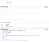
>>6177i thought that was it at first too but it's not that
No.6180
>>6179it's something easy to patch on my end but it seems like something you should patch because requiring that cookie is no longer vichan api
No.6181
whatever you did fixed it
thanks
No.6182
I wanted to get /b/thread/5941.json to work in case, but that's seeming to be harder than i thought with all the rules in the server block
No.6183
will replace the floatbar concept with a window that appears on page startup when there's a new news item.
This will contain the message of the day concept that was attached to the vichan UI and reduce the number of info messages on first load.
No.9133
the good old days...
No.11305
yes, this was quite bad, but I was still in the right
No.11306
It surprises me just how recent the current implementation of the custom UI is. I always think it was introduced earlier than it actually was. I guess that speaks to how good of a design it is.